
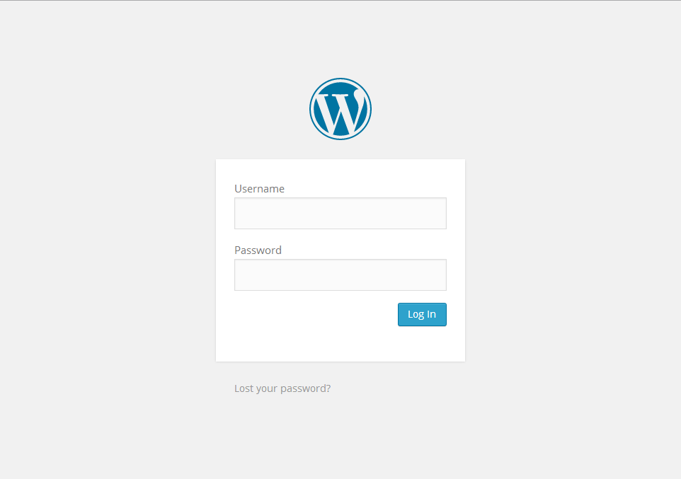
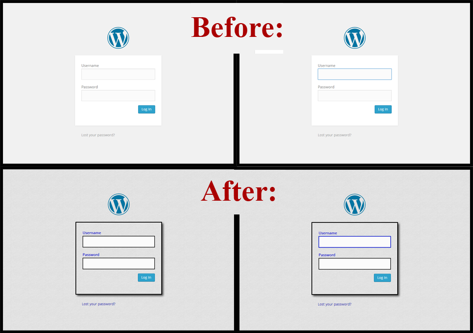
The login page for WordPress is very washed out, with text labels that are difficult to read, and borders around textboxes that are virtually invisible:
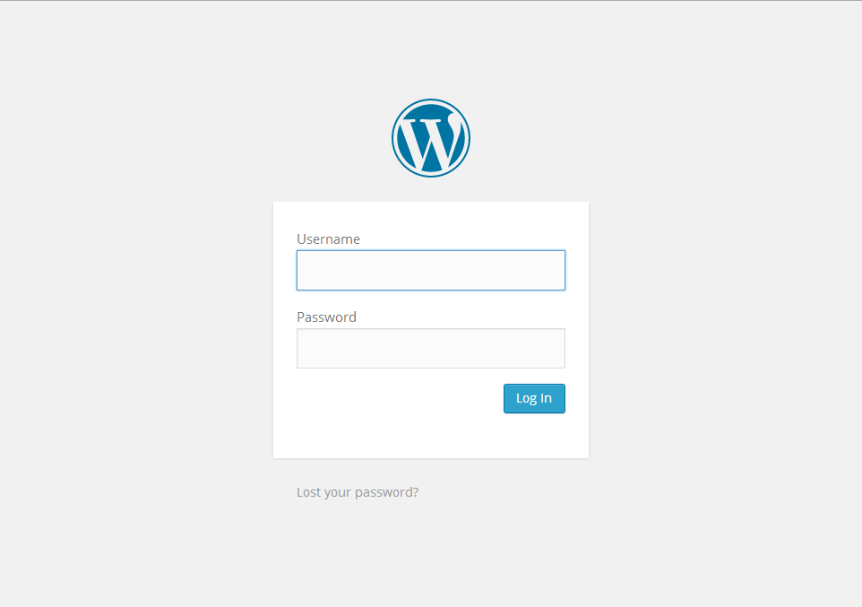
The situation is somewhat better when a textbox has been clicked, but the border is still very light:
Custom Login plugin by Austin Passy was installed recently on this blog, and the visibility of the login screens is no longer a problem.
A short list of changes that were made:
- A textured background gif was added (repeating), covering the shocking white.
- The same repeating background was added to the background of the login form as well.
- The login form was given a 3 pixel wide black border.
- The plugin’s default box shadow (5px 5px 10px) for the login form was added.
- The login form label color was changed to blue (#0000cc), with an opacity of 1.
In addition, the Custom Login plugin allows custom CSS. The following CSS changes were thus made:
/* BLACK BORDERS AROUND TEXTBOXES */
input[type=email], input[type=number], input[type=password], input[type=search], input[type=tel], input[type=text], input[type=url], select, textarea {
     border: 2px solid #000000;
}

/* BLUE BORDERS AROUND TEXTBOXES (if textbox has been clicked) */
input[type=email]:focus, input[type=password]:focus, input[type=text]:focus {
     border: 2px solid #0000cc;
}

/* DISPLAY TEXTBOX LABELS IN BOLDFACE FOR ADDED VISIBILITY */
#login label {
     font-weight: bold;
}
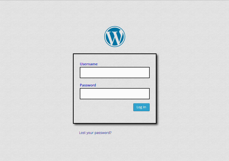
Saving these changes gave the following result:
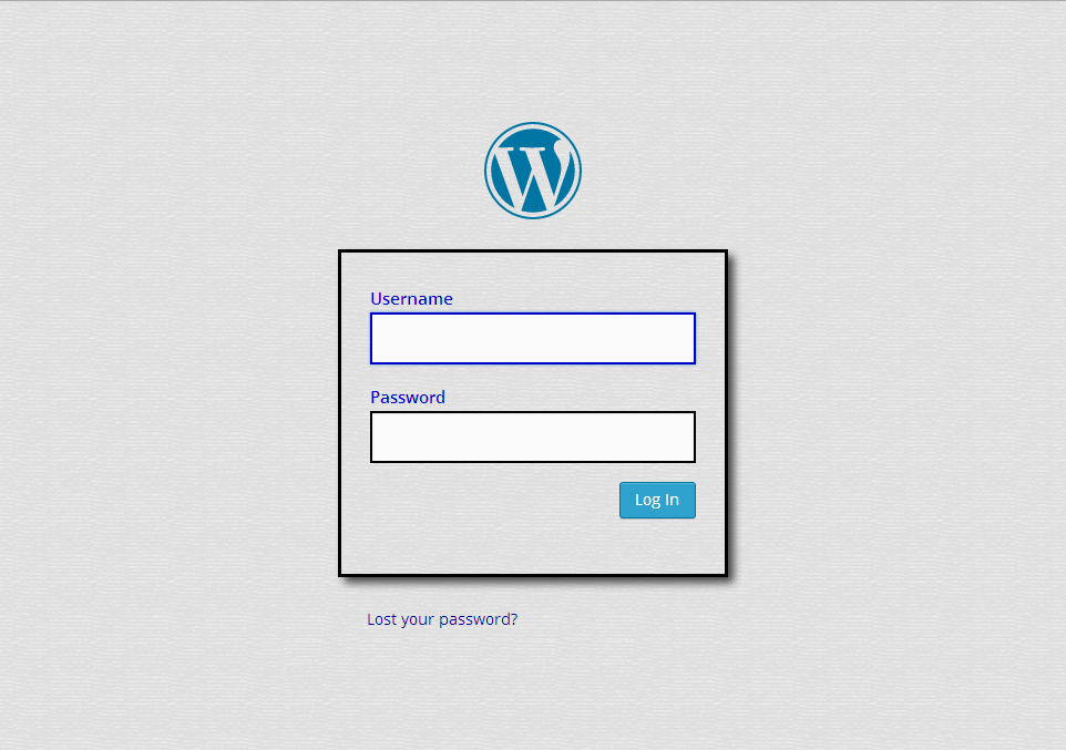
The page now looks like this when the textboxes are clicked:
Others may wish to use Custom Login to change the logo as well. But my goal was more modest: to set up a login page that rests easier on the eyes:
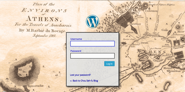
UPDATE (Jun 30 / 2014): Nice. The new login page for my Ancient Greek blog: